I have a real soft spot in my heart for Hans Rosling. It’s for 3 big reasons. First, he’s an empiricist. He always asks what the data really say. And then he adjusts his thinking to the facts, not the other way around. Second, he’s helped create some really, really cool software and webtools. Like the page (app? toy? tool?) you’re going to see in a moment. I love this stuff particularly because I’m very visual spatially oriented myself and Hans uses data and graphs to tell a stories. Finally, he’s a bit of a showman. Ok, “a bit” is understatement. Anybody who has swallowed a real sword in a TED talk in search o f making a point is cool.
So who is Hans Rosling? He’s the creator of Gapminder.org, a website and organization that collects international statistics and data on economics, health, wealth, and people’s general well-being. They then make those statistics available in ways that you and I can interrogate them and the stats tell us a story.
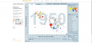
 The best way to begin to understand what Gapminder can do is to try it. I want you to click on this link: www.bit.ly/b3JZNB. It should open in a new window or tab to a page that looks like this. Then click on Play. You’ll see the story of family size vs. life expectancy in each country of the world (color coded by continent and sized by population) as they retrace the history of the world since 1950. Hans asks, if our stereotype of “developing” countries being high-birth rate and low life expectancy vs. the opposite in developed countries is still true.
Another great IMO interactive graph is this one http://www.bit.ly/11rv4NV where the last 200 years of the world play out in a plot of wealth (GDP per person) vs. health (life expectancy at birth). We see that the whole world essentially started at the same place 200 years ago – poor and short-lived. But quickly European and then North American countries shoot ahead. But lately most of the world is catching up and converging to be rich and long-lived. Some countries and economic systems got rich first and then translated rich into long-lived. Others have improved health and then that led to riches.
For an explanation of all the elements of one of these graphs, see this http://www.gapminder.org/GapminderMedia/wp-uploads/tutorial/Gapminder_World_Guide.pdf. The neat part of this tool isn’t just the graphs Gapminder has created. It’s that you can create and explore your own. Look at the pdf explanation. It shows how you can click on various parts of one the earlier graphs to change it and create your own analysis. Try it. See what you find or learn and then blog about it.